| 2-page_condensed_jan-jun-2021-mini-catalog-last-chance-products_discounted.pdf |
|
The January-June Mini Catalog is retiring at the end of June! Click on the file below to see all the items leaving. Some are even on sale but don't wait--they are all "while supplies last"! Use Hostess Code HRK4AT6A to order.
0 Comments
I am so happy to be able to start hosting events in person again! Holding my New Catalog Open House on the 15th was wonderful. I had set up displays of lots of samples of cards I had made with new items. Here are a few to show off some of my favorite new products and suites.
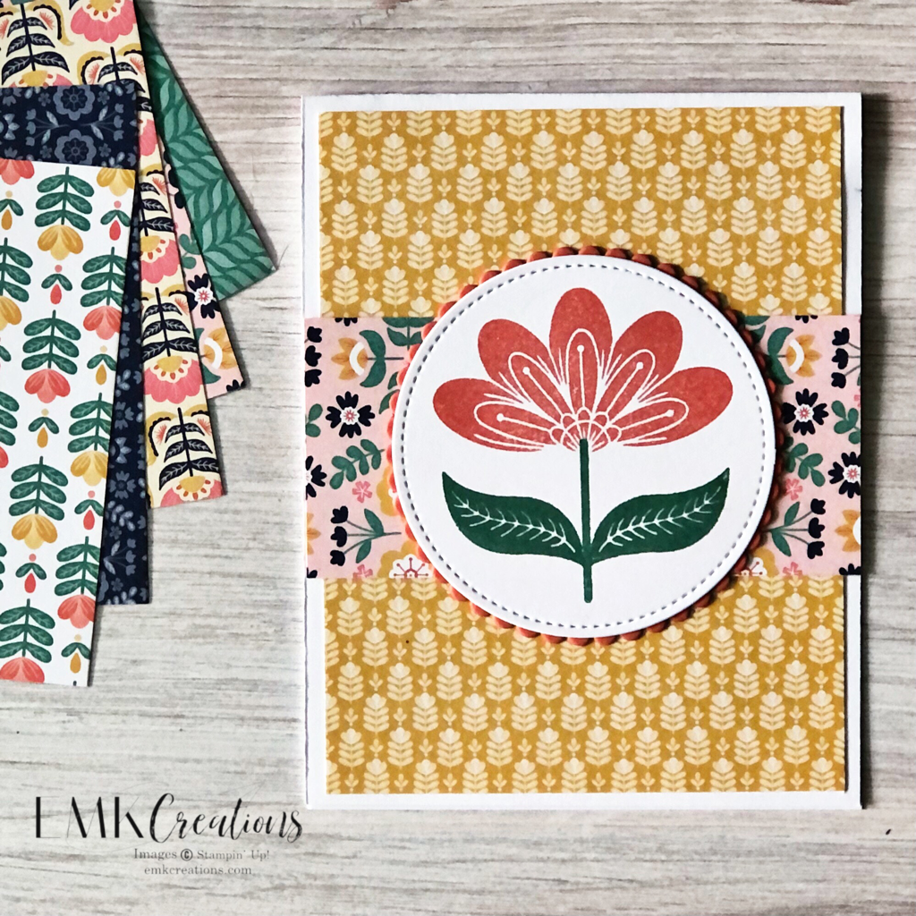
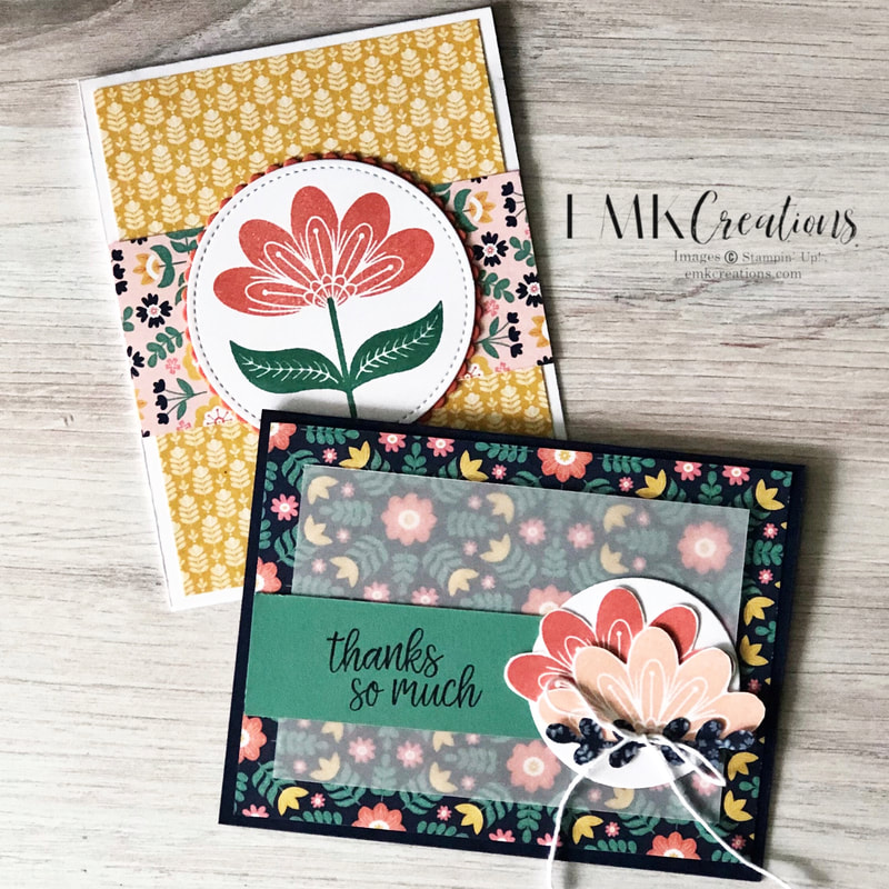
The Sweet Symmetry suite is a particular favorite. The colors in the Designer Series paper call to me! They are bold and work so well together. I also enjoy the solid imagery in the stamps. This card is a pretty simple one and a great one for using your paper share papers!
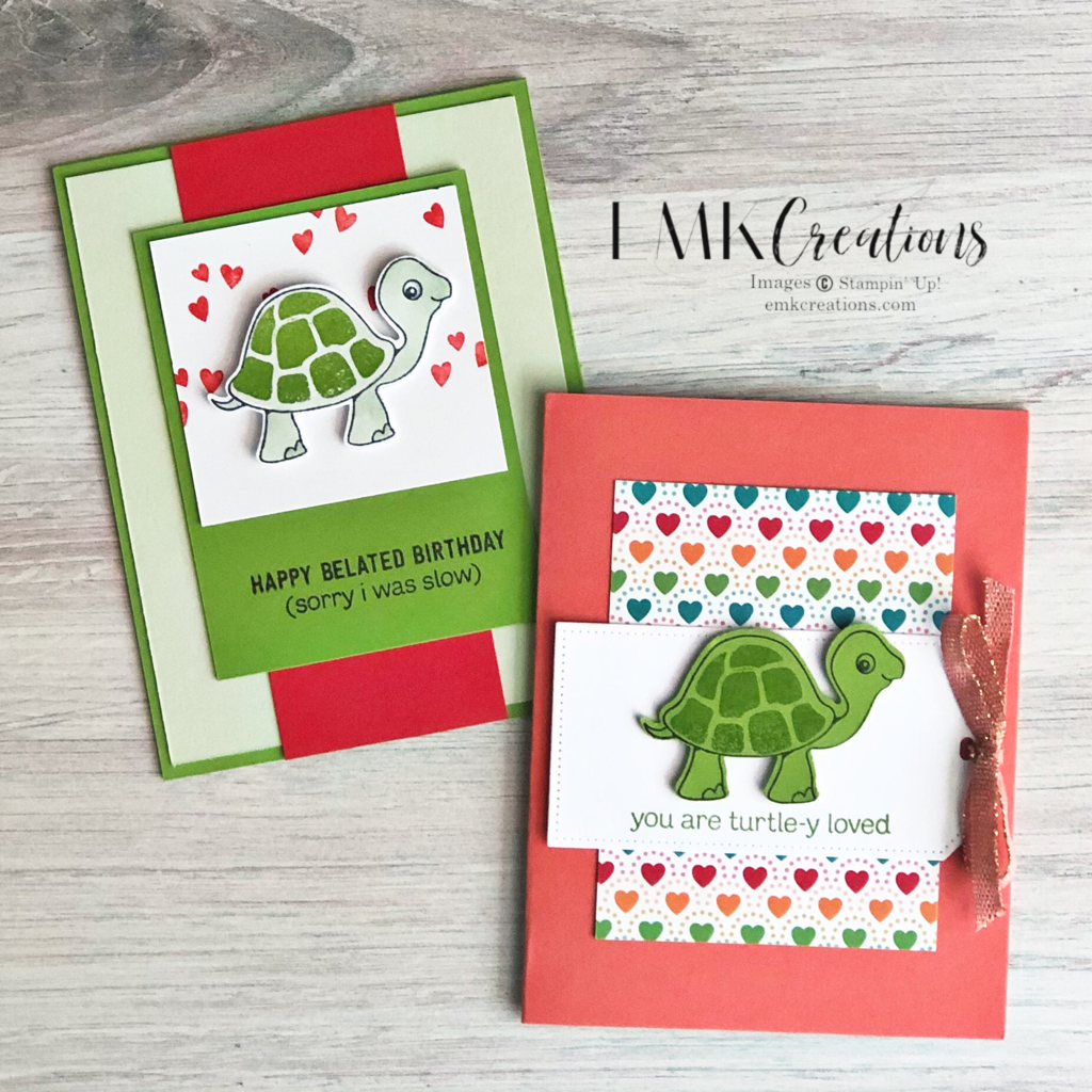
The You're a Peach Suite is another fun one. Be sure to check out the adorable jam jars that are available as part of the Suite Collection (page 60). Both of these cards use a simple layout but I changed it up a little adding the Pear Pizazz card stock piece on one of them.
Adding a little vellum over the top of a bold Designer Series Paper is a trick I love to use! This is nearly a CASE from the catalog!
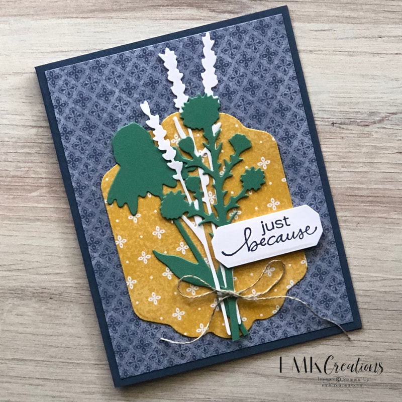
I honestly overlooked the Quiet Meadow bundle the first few times I flipped through the catalog but it has so much to offer! The dies are a lot of fun to work with.
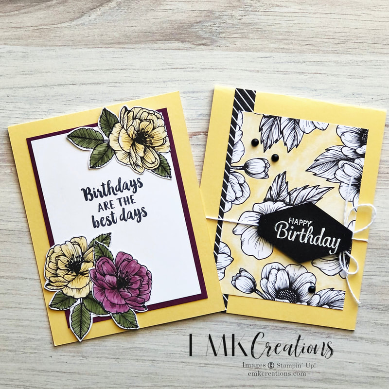
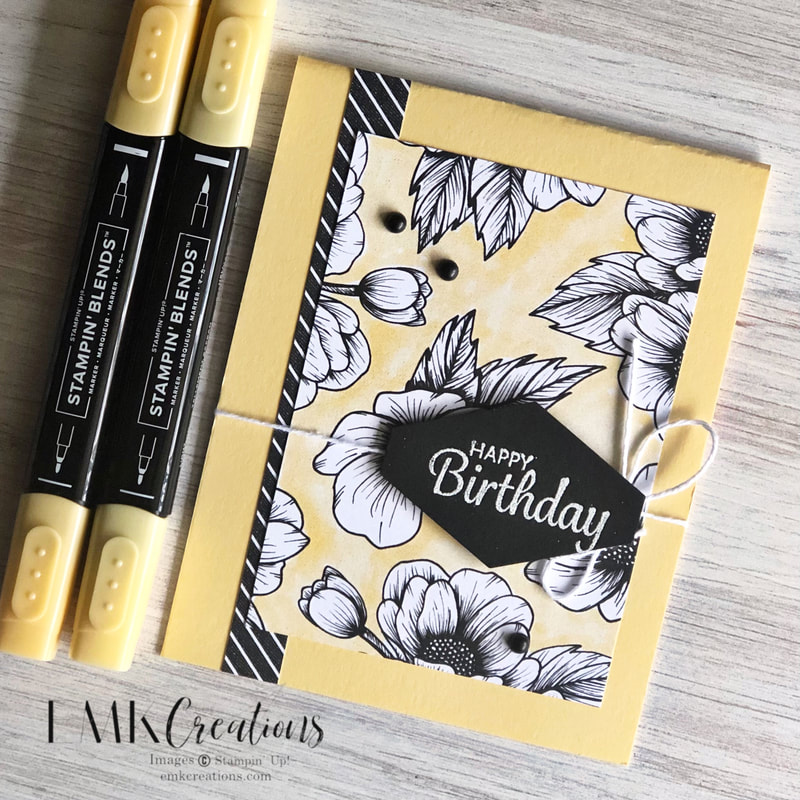
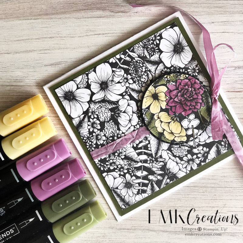
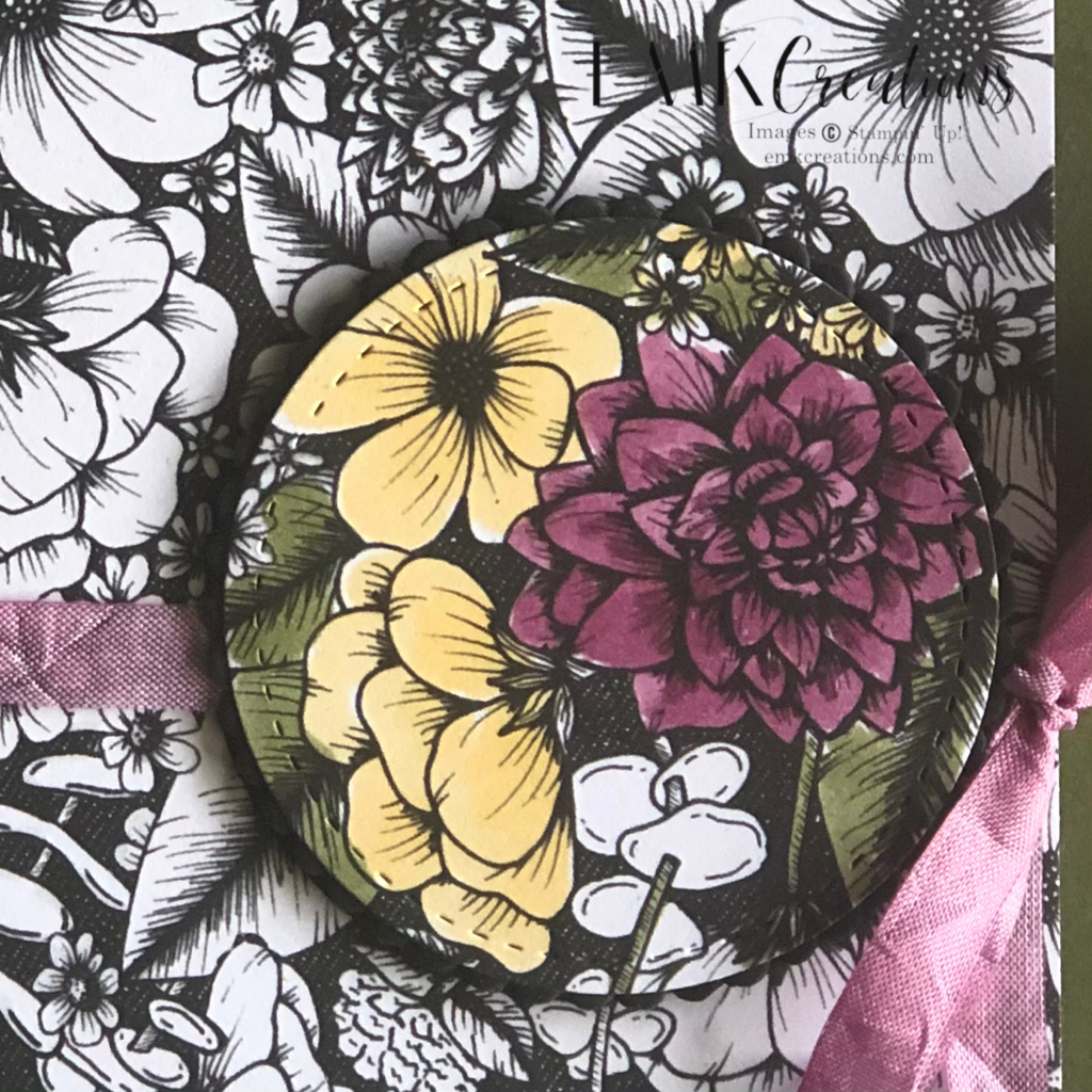
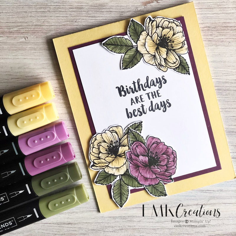
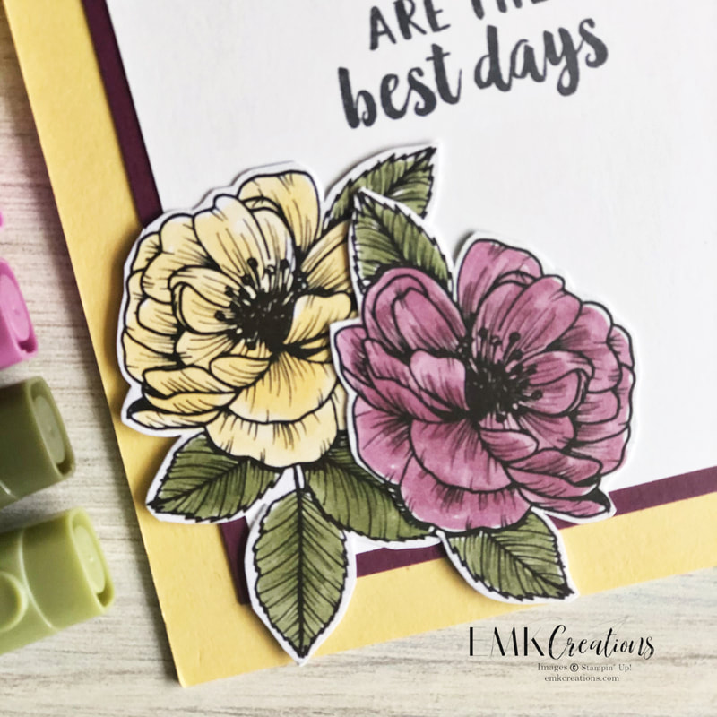
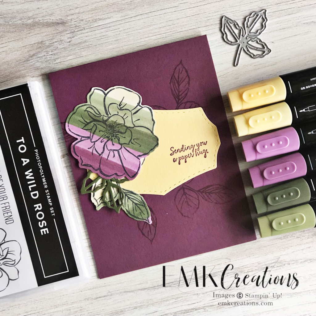
What is your favorite new suite or bundle in the catalog? I created a class featuring only three Blends sets to show off the versatility of these great coloring tools. I wanted to provide a class where I could focus on techniques and ideas using Blends. There are so many options when coloring with Blends! One idea I love is to color the negative space instead of focusing on the main images. Highlighting and only coloring a small portion of a card is another great way to add an interesting feature to your card. Here I die cut the portion I was going to color and then mounted it on a black scallop before adhering it to the card front. Don't forget that you can use the Blends to color your white ribbons as well. This gives you the ability to have ribbon in any color you want! Simply use the brush tip to add color. There is not right or wrong way to color with Blends. We all have our favorites. For me, I usually start with the dark color and add it in the middle and along black outlines. I then go over it all with my light to do my blending. The colors I used in all of these were Rich Razzleberry, Mossy Meadow and So Saffron. Another fun technique I've been using a lot is to create a striped piece of paper using blends on white cardstock. I then stamp and image and cut it out creating the fun striped coloring on my image.
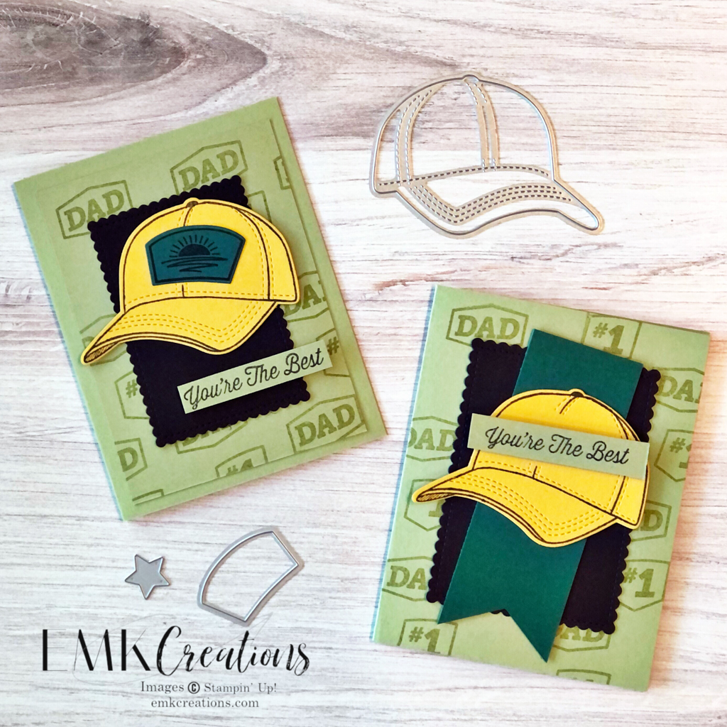
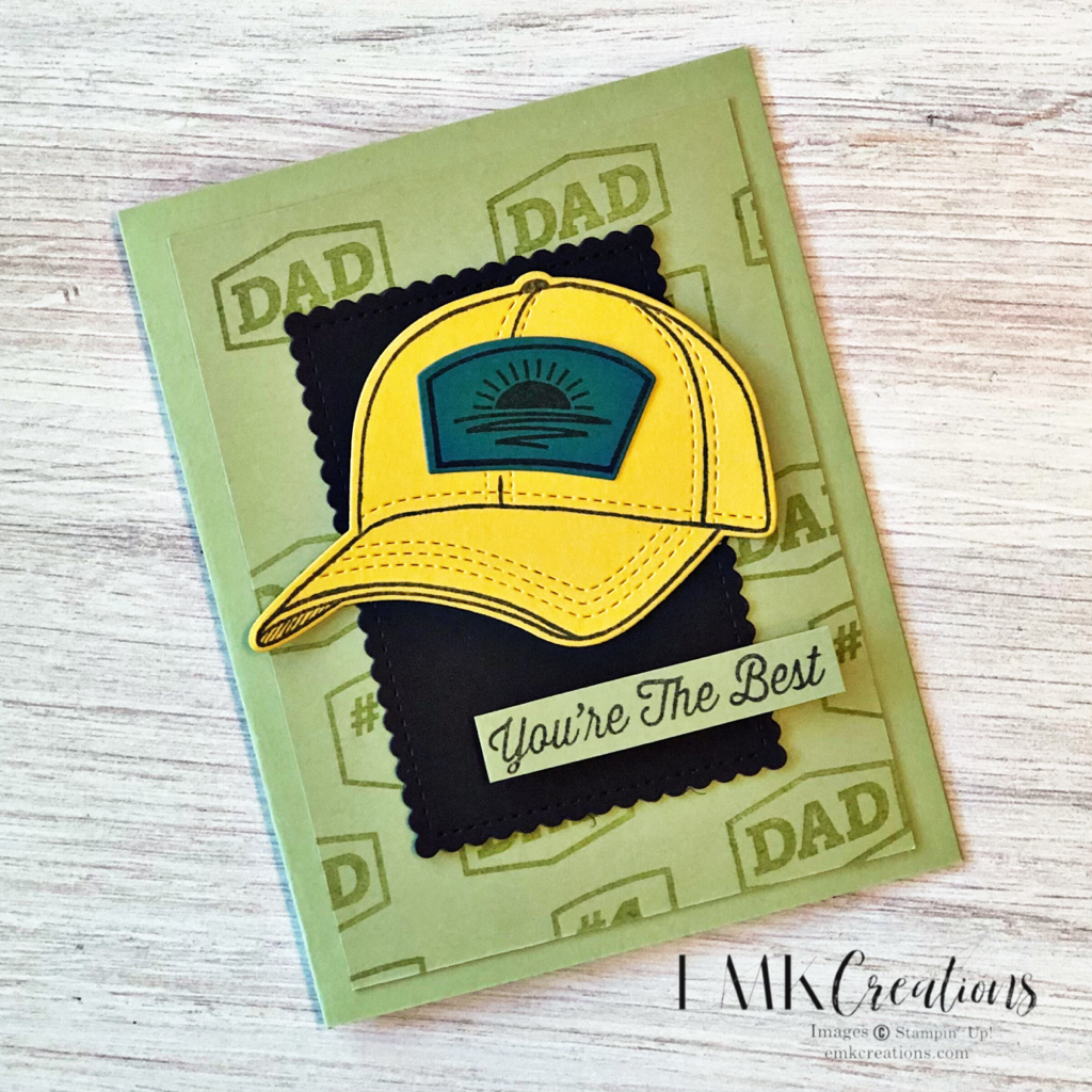
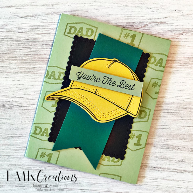
This fun new bundle has so many possibilities. I started with a partial CASE from the annual catalog.
This is the slightly stepped up version with an extra layer of Pear Pizazz card stock. I also die cut a piece for the front of the hat.
This version is a single layer of Pear Pizazz but I did the same tone on tone watermark stamping for the background.
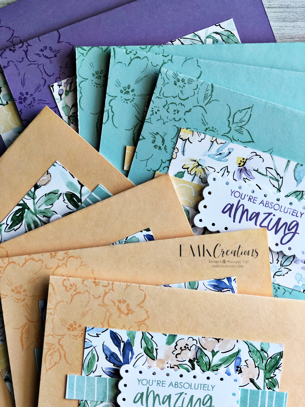
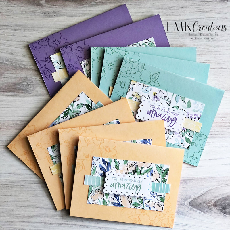
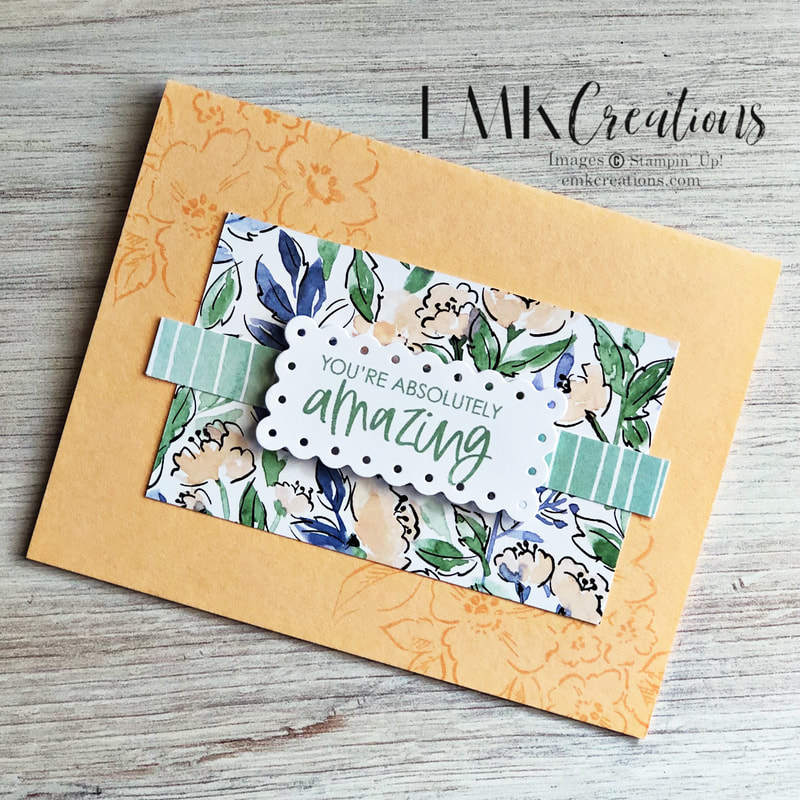
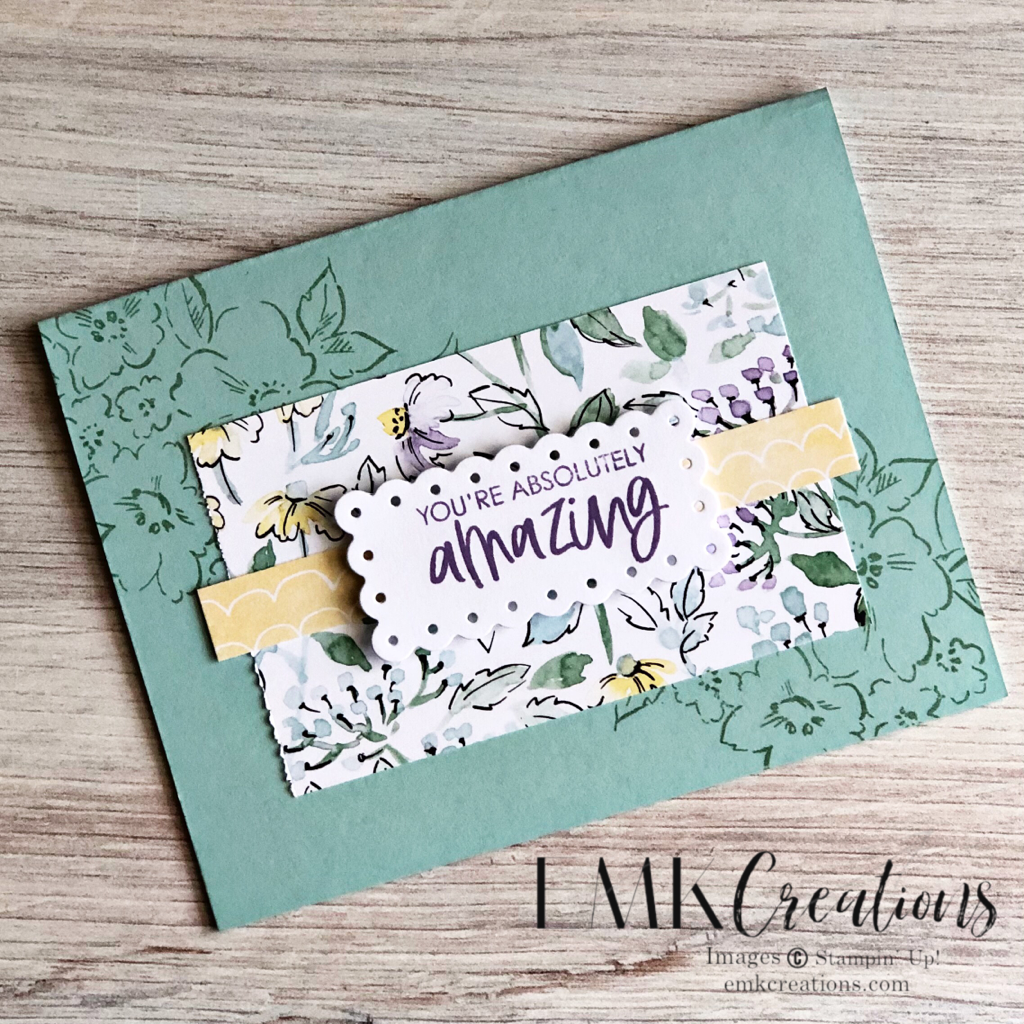
These will be my thank you cards for my customers this month. I was excited to show off the new Hand-penned stamps and paper! Plus many of the new In Colors are featured as well.
This is a very easy layout utilizing a 4 x 2 1/4 piece of Designer Series Paper with a 1/2 x 4 1/2 strip of coordinating paper on top.
The small die from Scalloped Contours was the perfect piece to stamp my sentiment on.
Which color combo is your favorite?
Product List
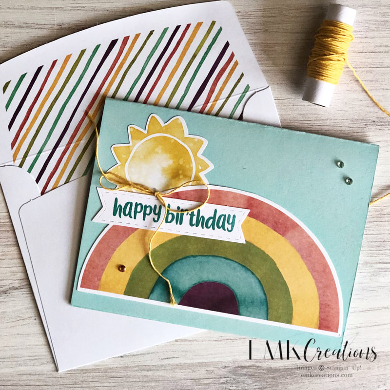
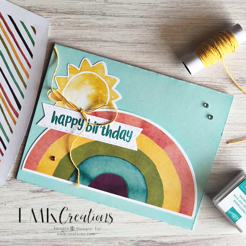
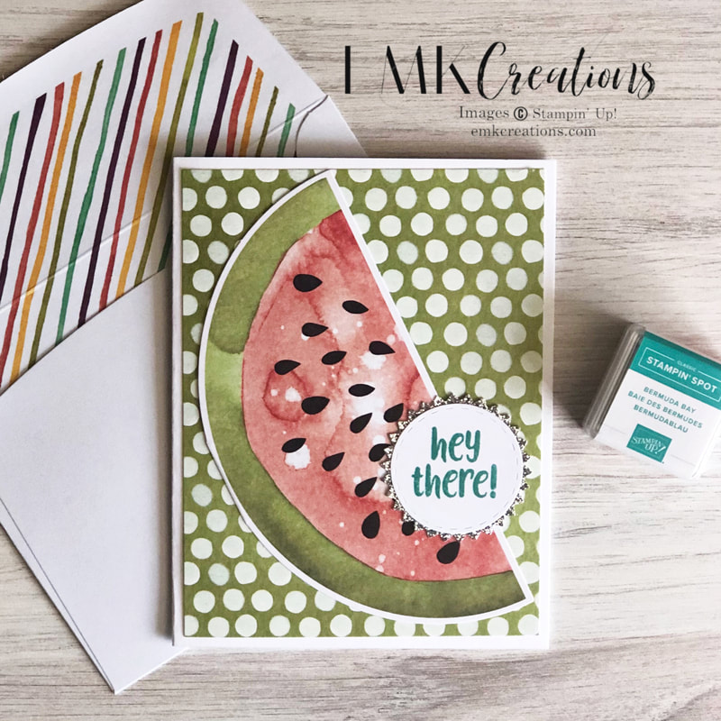
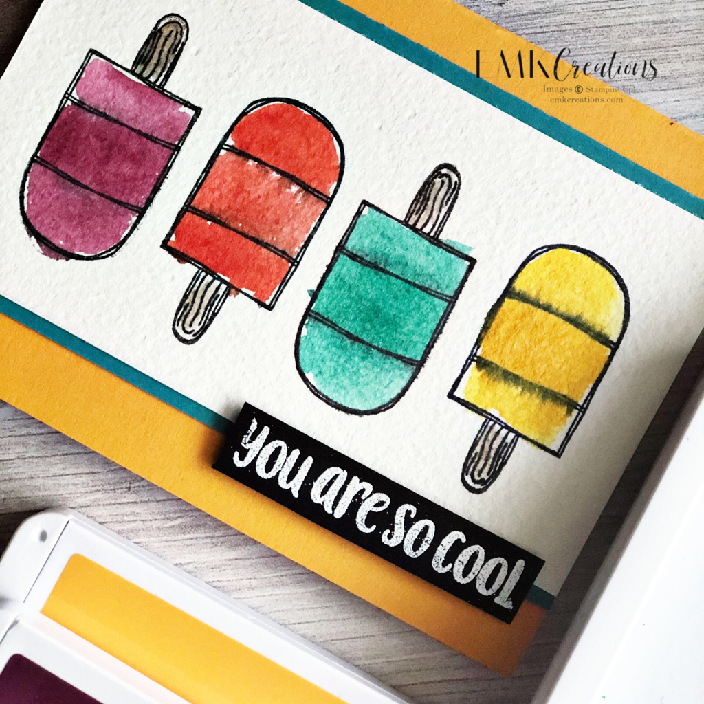
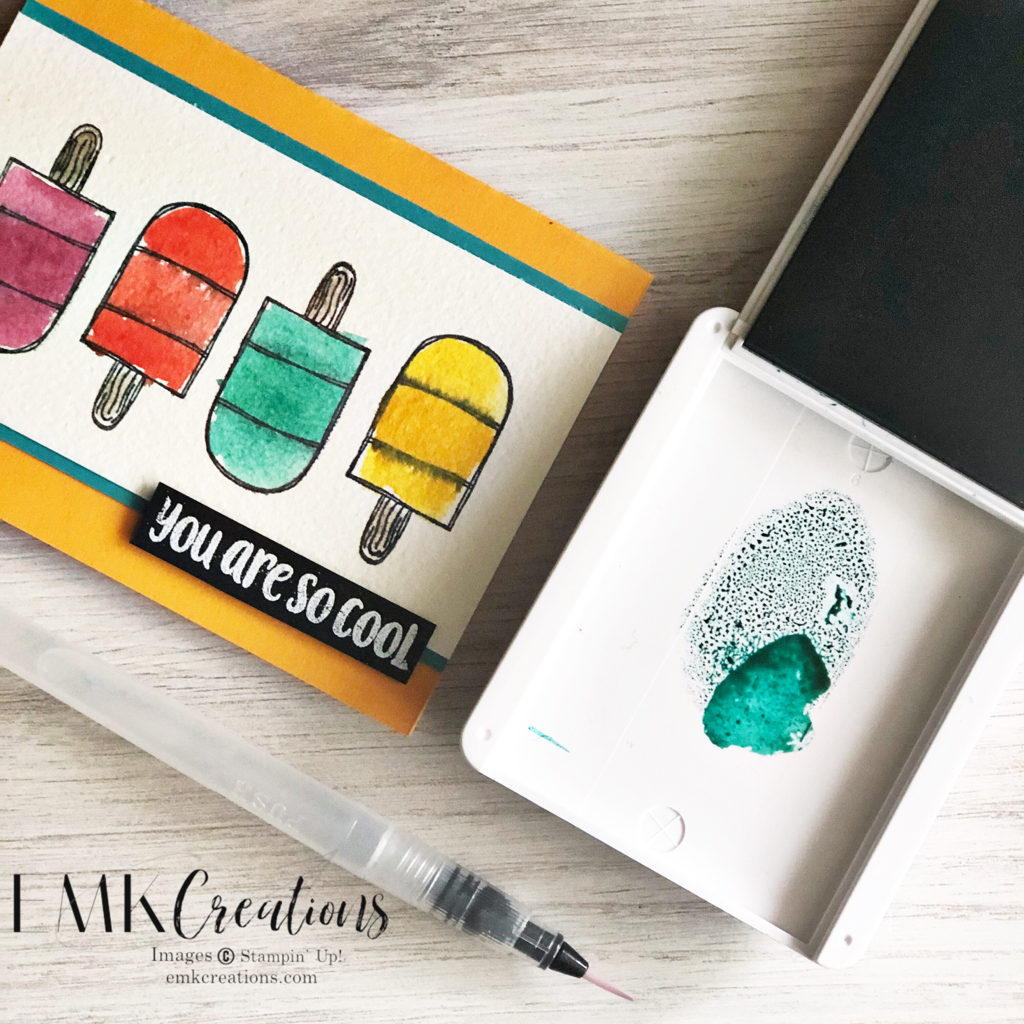
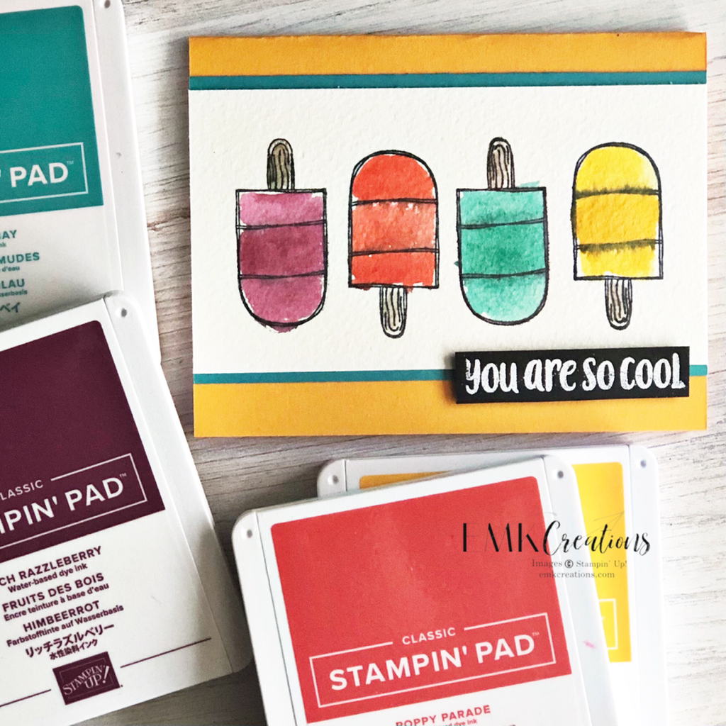
The April Paper Pumpkin is full of fun! From the colors to the images I loved working with this kit. Cutting apart the rainbow card and using it as the focal point made this one easy to create. Add a sticker and it's done! The Ice Cream Corner paper is a great compliment to the kit. Once again, cutting the watermelon base in half allows you to use it on a full size card front. The silver glitter accent is a great touch as well. A quick a watercolor wash of ink on watercolor paper in bright bold colors makes me happy. Here's to summer treats! Adding ink to the top of the ink pad lid makes it easy to pick it up with the water painter.
My color choices include Rich Razzleberry, Daffodil Delight, Bermuda Bay and Poppy Parade. |
AuthorI'm a "work at home mom" and an independent Stampin' Up! demonstrator. Archives
July 2024
Categories
All
|





 RSS Feed