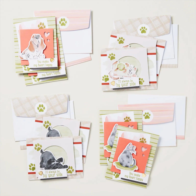
Monday Montage Blog Hop is here again! This week I'm highlighting the adorable new By Your Side kit. Have you seen it? It makes eight cards but the best part is you get double the number of cats and dogs so you can create lots more cards!
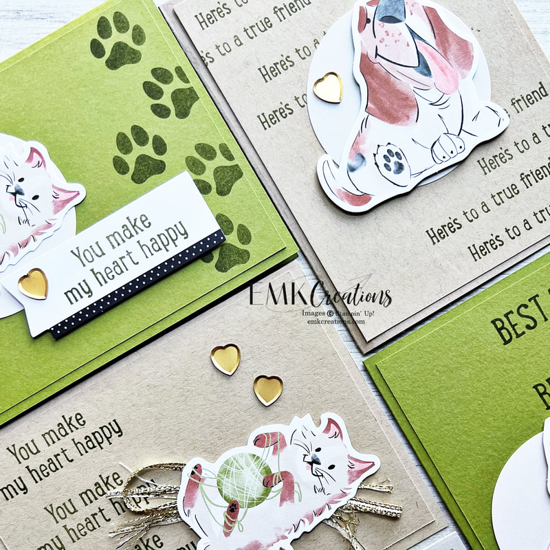
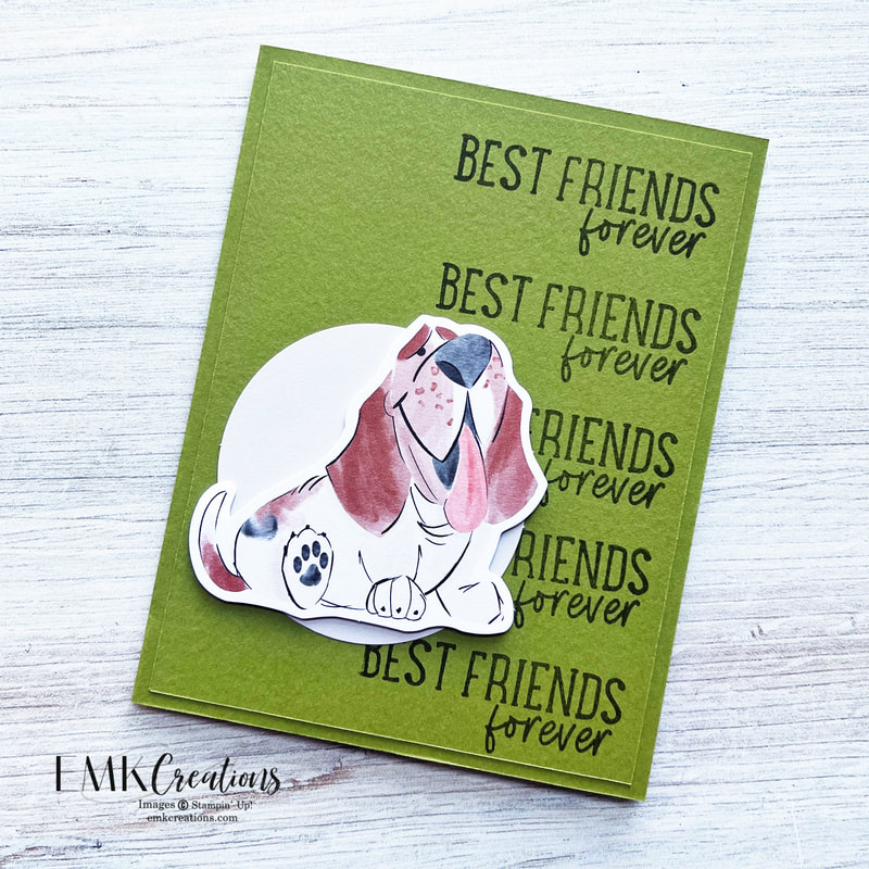
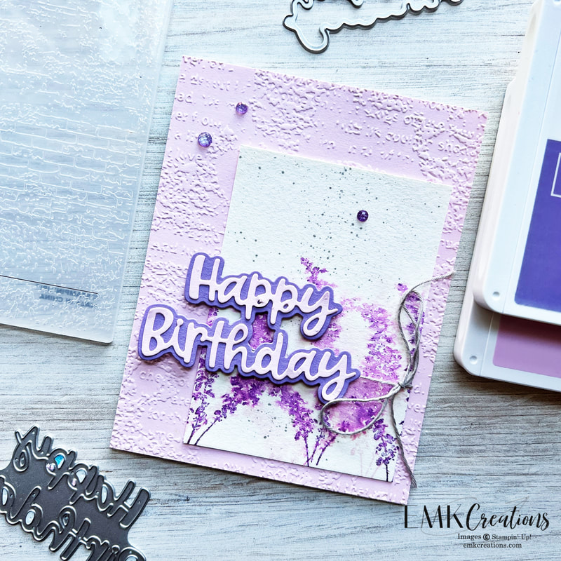
All of these cards were created with just adding some extra card stock and ink.
Adding a little distressed ribbon seemed cute to go with the yarn!
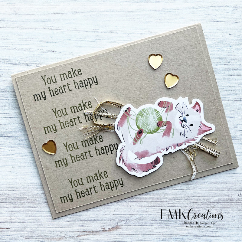
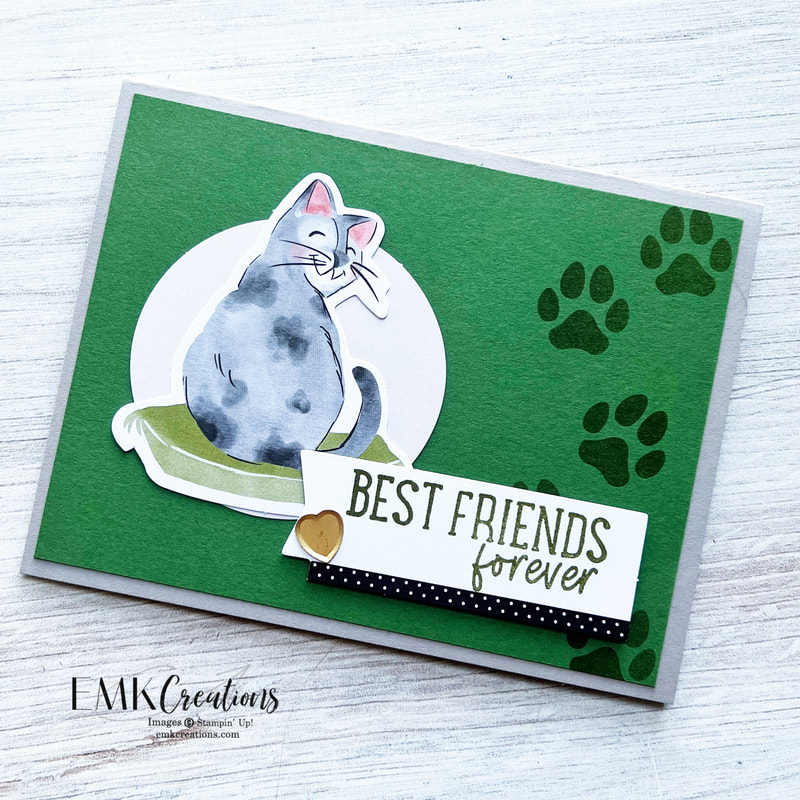
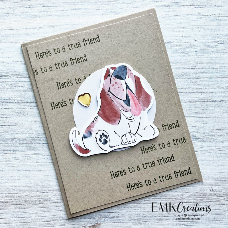
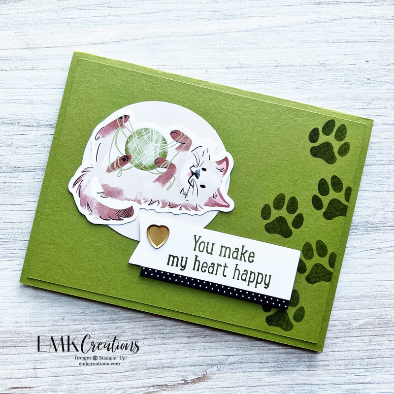
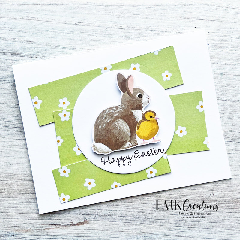
Are you team cat or team dog? All of these animals are adorable and make it so easy to create cards.
Be sure to click through to see all the great projects. Up next is Wendy!
Be sure to click through to see all the great projects. Up next is Wendy!
")


 Trim Combo Pack")


")


")


")
 Designer Series Paper")
")


")

")


")

")


")
 Specialty Designer Series Paper")
 Designer Series Paper")
 Designer Series Paper")


 RSS Feed